

ITSM bottleneck analysis: hidden incident-flow delays
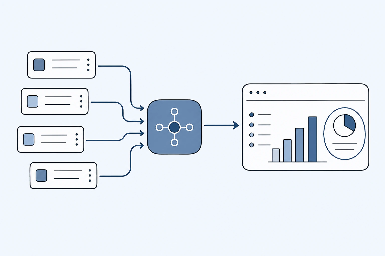
ITSM bottleneck analysis rarely finds one obvious queue. The real delays usually show up as repeated handoffs, unresolved ownership, and silent aging that gets washed out in blended SLA reporting.
When you isolate reassignment loops, queue-to-queue transitions, and age by service boundary, the real drag becomes visible. That is the point where incident management analytics turns into an operational decision backlog.
Why normal ITSM reports miss the bottleneck
Most service desks already have dashboards. They can show ticket volume, SLA breach counts, average resolution time, and the size of the open backlog. Those metrics are useful, but they usually describe the symptom after the delay has already happened.
The bottleneck is often hidden one level deeper. A queue may not own the ticket for long, but it may receive the same class of issue again and again. A resolver group may close its own work quickly, while the ticket spent days waiting in a previous assignment group. A request may look healthy in aggregate while a specific approval or handoff step creates most of the age.
That is why ITSM bottleneck analysis has to preserve the path of the ticket, not just the final status.
What to inspect in the export
A useful incident export should include the ticket identifier, opened and resolved timestamps, current and historical assignment groups, priority, category, short description, resolution notes, and enough status history to reconstruct waiting time. If status history is missing, assignment changes and update timestamps can still show where work is repeatedly transferred.
The first pass should separate:
- time waiting in queue
- time actively owned by a resolver group
- reassignment count
- reopen count
- age by category and service family
- repeat demand by short-description pattern
This separation matters because each delay has a different fix. Queue time may require routing or capacity. Reassignment drag usually means unclear ownership. Repeat demand may point to prevention, automation, or a knowledge article.
The decision output leaders need
The output should not be a larger dashboard. It should be a ranked decision list:
- Which assignment groups create the most delay?
- Which handoffs repeat often enough to fix?
- Which ticket families should become problem records?
- Which patterns are candidates for prevention or auto-resolution?
- What should be funded in the next 90 days?
That is the reason the ServiceNow Performance Analytics alternative page focuses on decisions rather than charts. The same raw export can produce a graph or it can produce a funded action plan. For executive teams, the second output is usually the missing one.
A practical scoring model
For each candidate bottleneck, score four things:
- Impact: how much total time or volume is attached to the pattern.
- Concentration: whether the issue is isolated enough to assign to a clear owner.
- Fixability: whether the cause can be addressed through routing, knowledge, automation, or policy.
- Confidence: whether the export has enough evidence to support the recommendation.
The best first moves are not always the largest queues. They are the patterns with enough impact, enough ownership clarity, and enough evidence to act without another six-week analysis cycle.
How this supports a Diagnostic Sprint
The Diagnostic Sprint starts from exactly this question: where is time being lost, and what should leadership fix first? If the export contains enough assignment, timestamp, and category history, the sprint can turn raw ITSM data into a decision pack within 5 working days.
If the export is incomplete, that is still useful. The first recommendation may be a data-readiness fix: add missing status history, normalize assignment groups, or separate incidents from tasks before drawing conclusions.
The goal is not perfect reporting. The goal is a short list of decisions with traceable evidence behind each one.